
Baseball is known for having some of the most unique logos and nicknames for teams across America. From the Lakeland Flying Tigers to the New Orleans Baby Cakes (RIP), Minor League Baseball has a way of entertaining fans with logos and memorabilia while also creating a fun baseball environment.
Here in Washington, we have some really creative high school and professional sports logos and nicknames. For me personally, I really enjoy the Everett Aquasox, Camas Papermakers, Lincoln Abes and the Richland Bombers.
So, what makes a good combination of logo and mascot? I think originality plays a huge factor.
Take the Lincoln High School Abes logo — they use a caricature of Abraham Lincoln with his signature top hat on with yellow eyes. But the kicker is the Los Angeles Dodgers “LA” right smack dab in the middle of the top hat.
What makes this logo great is that it is hard to find another “Abe” mascot. Credit to Tacoma School District for deciding on something original, but also not falling back on having it related to the area. I think a lot of schools try to think of something that is related to the area or just a basic animal, so when Lincoln decided on the Abes, that was a step in the right creative direction.
Camas High School went the local route, but went so specific that it benefited them in the coolest way. Camas High School gives reference to the town’s papermaking past with their “Mean Machine” logo. The paper rolling machine has eyes with a furrowed brow with the letters CHS down the side.
Like the Abes, the Camas logo and mascot are so good because you won’t find another Papermaker school around. That is what makes most logos special. There isn’t another one like it.
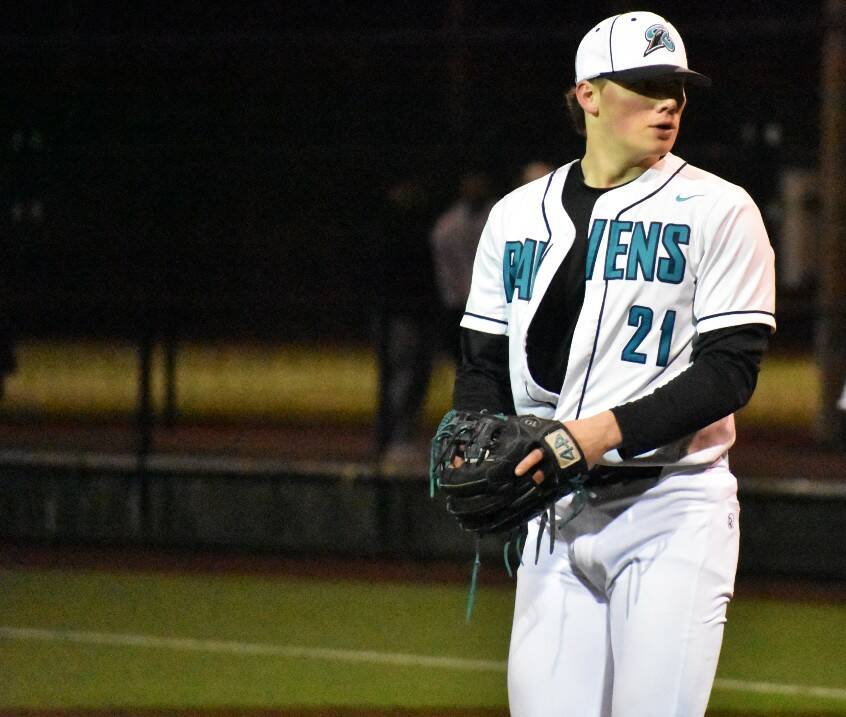
On a more local level, Auburn Riverside High School has deployed a new baseball hat this season with a new logo. A sleek raven head sits on the “R,” which is a different take on the Riverside logo for baseball season. Most schools in the area use primarily a letter for their logo in the school font. So it is hard to kind of decipher which ones are better than others. Renton has used the Tacoma Rainiers “R,” which is a logo that will always be easy on the eyes.
If we turn to pro baseball and just look at the teams in our Pacific Northwest region, we don’t have to go far to find amazing logos. From the Mariners High-A Aquasox frog logo to its actual blue sock logo — if anyone wondered what tree frogs socks would look like, the folks in Everett got you covered.
Even down south, there’sthe Eugene Emeralds alternate jersey from last season, the Exploding Whales. It’s a tribute to the 1970 whale that was beached in Florence, Oregon, that was disposed via dynamite.
The Emeralds’ alternate logo consisted of a whale wielding a baseball bat that is a stick of dynamite.
Logos and mascots are fun and should be unique because it creates more interest and love for a team or school rather than just the same old badge and random animal or bird. It is a lot cooler for fans to support the Papermakers or even the Ravens of Auburn Riverside, rather than a Cougar or Lion.
–
Ben Ray covers sports across South King County. Contact benjamin.ray@fedwaymirror.com.
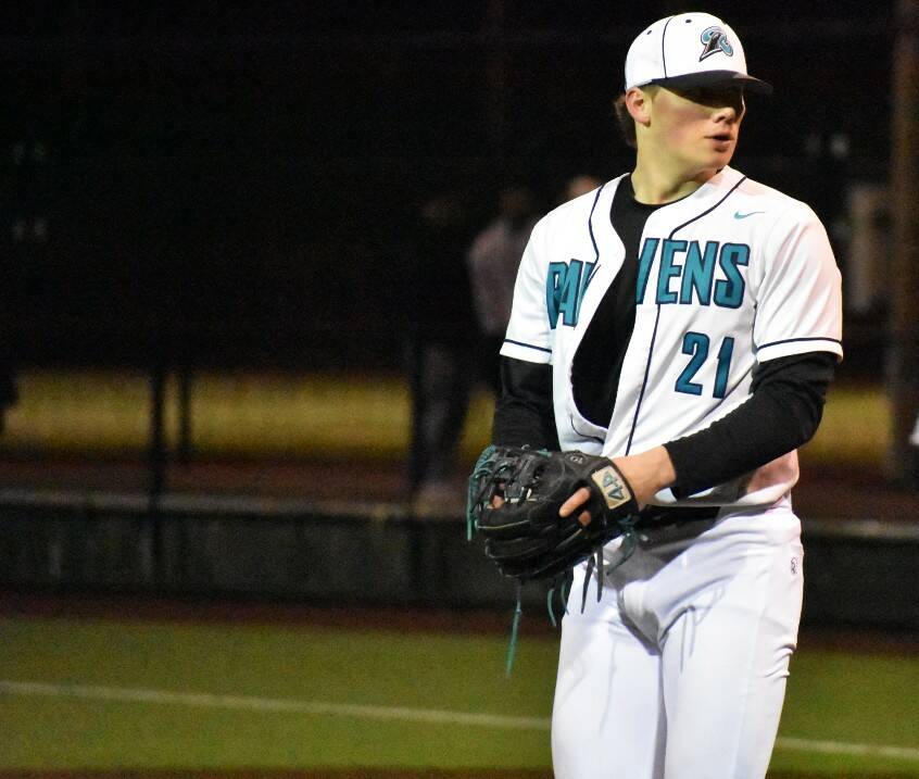
Jackson Padur of Auburn Riverside eyes down the Eagle batters coming out of the bullpen. Photo by Ben Ray / Sound Publishing
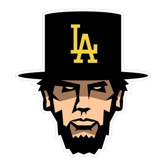
Lincoln Abes logo. Courtesy image
